Homework 3
The Definite Integral as a Limit(1966)
Please watch the video above. Can you find a better alternative -- poor video is getting old...
Use our formulas from class to evaluate the following sums:
\[\sum_{i = 1}^{20} 100(i^2 - 5i + 1)\]
\[\sum_{i = 1}^{50} (i^2 - 10i)\]
- Use Riemann sums to approximate the area under the curve for the given function on given interval:
- \(n = 4\) for \(f(x) = \frac{1}{x-1}\) on \([2, 4]\)
- \(n = 4\) for \(f(x) = \cos(\pi x)\) on \([0, 2\pi]\).
- \(n = 8\) for \(f(x) = x^2 - 2x + 1\) on \([0, 2]\).
- Let \(r_j\) denote the total rainfall in New York City on the \(j\)th day of the year in 2020. Interpret
\[\sum_{j = 1}^{31} r_j\]
- Below is the data from our Central Park weather station. We have isolated the Precipiation column, and plotted both it and the total precipitation for the month of January in the year 2020. How could we make the second plot using the first? (HINT: Look up what the
.cumsum() method does in Pandas, or just think about what we’re doing in class!)
<tr style="text-align: right;"> <th></th> <th>DATE</th> <th>PRCP</th> </tr> </thead> <tbody> <tr> <th>0</th> <td>1870-01-01</td> <td>0.08</td> </tr> <tr> <th>1</th> <td>1870-01-02</td> <td>1.18</td> </tr> <tr> <th>2</th> <td>1870-01-03</td> <td>0.00</td> </tr> <tr> <th>3</th> <td>1870-01-04</td> <td>0.00</td> </tr> <tr> <th>4</th> <td>1870-01-05</td> <td>0.00</td> </tr> </tbody></table>

- Below is a plot of the average weekly earnings by americans according to the Bureau of Labor Statistics. How can you use this plot to determine the average wage from 2009 to 2019 measured each quarter. How can you use this graph to determine the average weekly earning over the 10 year period?
<img src = 'images/a3p4.png'>
</center>
- Useful summations:
AVERAGE:
\[\frac{1}{n} \sum_{i = 1}^n x_i\]
VARIANCE:
\[\frac{1}{n} \sum_{i = 1}^n (x_i - \mu)^2\]
where \(\mu\) is the mean of the data
Use these formulas to compute the mean and variance of the datasets below. What does the variance explain about a dataset based on your observations?
- Dataset 1:
[5, 5, 5, 4, 4]
- Dataset 2:
[1, 3, 5, 7, 9]
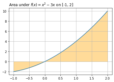
- Recall our power rule and evaluation method for definite integrals from class today. Use this to evaluate the following definite integrals. For an extra challenge, try to draw a plot and fill in the area using the example below.
- \(\int_{-1}^2 (x^2 - 3x) dx\)
- $:nbsphinx-math:int_{-2}3(x2 + 3x - 5)dx $
- \(\int_{1}^2 x^9 dx\)
- $:nbsphinx-math:int_{1}^2 \frac{2}{x^3} dx $
- Integration has long been an important part of the freshman calculus sequence at major universities. So much so that MIT even holds a regular integration bee where students solve challenging integration problems. Solving these problems was also an important part of early Artificial Intelligence work at MIT, namely the SAINT computer program that was written to solve symbolic integration problems. Please read a few pages of the work
here. What do you think about this? Should we do things if we know there are machines that can do them better? What does this mean for math class!
- How could we use our ideas around area to think about computing the volume of the shape shown below? Describe a procedure for doing so.