Day 3: Functions
Goals:
- Review Linear, Exponential, and Harmonic Functions
- Understand parameters of each function type
- Use Functions to approximate data
[1]:
from IPython.display import HTML

HTML('''
<center>
<h4>A Movie About Functions</h4>
<iframe src="https://player.vimeo.com/video/101690069?title=0&byline=0&portrait=0"
width="700" height="394" frameborder="0" webkitallowfullscreen mozallowfullscreen
allowfullscreen></iframe>
</center>
''')
[1]:
A Movie About Functions
Linear Functions: College Debt
Returning to our example of paying down college debt, we examine the relationship between time and balance for a student who faces no compound interest.
- Start with 40,000 dollars debt
- Pay 500 dollars a month until no debt left
QUESTIONS:
- Make a table of values for the first five months:
| Month | Balance | Amount Paid |
|---|---|---|
| 0 | 40000 | 0 |
| 1 . | . | . |
| 2 . | . | . |
| 3 . | . | . |
| 4 | . | . |
| 5 . | . | . |
- What would the balance in month 10 be?
- How much would be paid in month 20?
- Can you generalize this to a function that takes as input the number of months and returns the balance in the account?
[ ]:
[ ]:
[ ]:
[ ]:
[ ]:
Linear Functions: Experiment
A general form of the linear function would be:
Use the interaction below to answer the following questions:
- What does the parameter \(a\) control about the graph? What is the difference between the cases where:
- \(a < 0\)
- \(a = 0\)
- \(a > 0\)
- What does the parameter \(b\) control about the graph? What is the difference between cases where:
- \(b < 0\)
- \(b = 0\)
- \(b > 0\)
[2]:
%matplotlib inline
import matplotlib.pyplot as plt
import numpy as np
import pandas as pd
import ipywidgets as widgets
from ipywidgets import interact
[3]:
def f(x, a, b):
    return a*x + b
[4]:
x = np.linspace(-10, 10, 1000)
[5]:
def linear_plot(a, b):
    plt.figure(figsize = (15, 6))
    plt.plot(x, f(x, a, b))
    plt.grid()
    plt.ylim(-10, 10)
    plt.xlim(-10, 10)
    plt.axvline(color = 'black')
    plt.axhline(color = 'black')
    plt.title(f'a = {a}\nb = {b}', loc = 'right', fontsize = 20)
    return plt.show()
[6]:
A = interact(linear_plot, a = widgets.IntSlider(2, min = -10, max = 10), b = widgets.IntSlider(3, min = -10, max = 10));
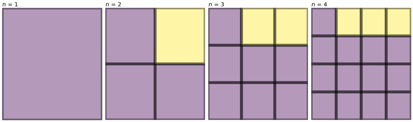
Quadratic Growth
Use the image below to answer the following questions.
- Draw the next image in the sequence.
- Complete the table of values below:
| n | purple boxes | yellow boxes |
|---|---|---|
| . | . | |
| . | . | |
| . | . | |
| . | . | |
| . | . |
- Do you see a pattern to how the purple boxes are growing? Explain.
- Do you see a pattern to how the yellow boxes are growing? Explain.
- Describe a rule that would predict the number of purple squares given any value of \(n\). Plot your results on the interval \(1 \leq n \leq 100\). What shape does this graph resemble?
[7]:
n0 = np.array([[0]])
n1 = np.array([[0, 0], [0, 1]])
n2 = np.array([[0, 0, 0], [0, 0, 0], [0, 1, 1]])
n3 = np.array([[0, 0, 0, 0], [0, 0, 0, 0], [0, 0, 0, 0], [0, 1, 1, 1]])
fig, ax = plt.subplots(nrows = 1, ncols = 4, figsize = (20, 6))
for index, array in enumerate([n0, n1, n2, n3]):
    ax[index].pcolor(array, edgecolors = 'black', linewidth = 10, alpha = 0.4)
    ax[index].set_title(f'$n$ = {index + 1}', fontsize = 20, loc = 'left')
    ax[index].axis('off')
plt.tight_layout()
[ ]:
[ ]:
[ ]:
[ ]:
Experiment: Quadratic
In general, a quadratic function can be written in three canonical forms:
- Standard Form:
- Factored Form:
- Vertex Form:
Your goal is to describe the effect of each of the parameters \(a, b, \text{and} c\).
[10]:
def f(x, a, b, c):
    st = 'Standard'
    return a*x**2 + b*x + c

def f2(x, a, b, c):
    st = 'Factored'
    return a*(x - b)*(x - c)

def f3(x, a, b, c):
    st = 'Vertex'
    return a*(x - b)**2 + c


def quad_plotter(a, b, c):
    st = [f'${a}x^2 + {b}x + {c}$', f'${a}(x - {b})(x - {c})$', f'${a}(x - {b})^2 + {c}$']
    fig, ax = plt.subplots(nrows = 1, ncols = 3, figsize = (20, 8))
    for i, func in enumerate([f, f2, f3]):
        ax[i].plot(x, func(x, a, b, c))
        ax[i].set_ylim(-4,4)
        ax[i].grid(True)
        ax[i].axvline(color = 'black')
        ax[i].axhline(color = 'black')
        ax[i].set_title(f'{st[i]}', fontsize = 20, loc = 'right')
    return plt.show()
[11]:
x = np.linspace(-10, 10, 1000)
interact(quad_plotter, a = widgets.IntSlider(1, min = -5, max = 5), b = widgets.IntSlider(1, min = -5, max = 5), c = widgets.IntSlider(1, min = -5, max = 5))
[11]:
<function __main__.quad_plotter(a, b, c)>
[ ]:
[ ]:
[ ]:
[ ]:
Exponential Functions
- Suppose we know that a population of fish produces 1 new baby for every 10 existing fish each year. Use this and a starting population of 500 fish to complete the table below.
| Year | Population | Population Change |
|---|---|---|
| 0 . | 500 . | na |
| 1 | . | . |
| 2 | . | . |
| 3 . | . | . |
| 4 . | . | . |
| 5 . | . | . |
- What will the population be in year 10? Explain.
- When will the population reach 10,000? Explain.
[ ]:
[ ]:
[ ]:
Experiment: Exponential Function
Typically, we will represent an exponential function as:
As before, your goal is to describe the effects of varying the different parameters.
[12]:
def f(x, a, b, c):
    return a*b**(c*x)
[13]:
def exp_plotter(a, b, c):
    plt.figure(figsize = (15, 5))
    plt.plot(x, f(x, a, b, c))
    plt.ylim(0, 20)
    plt.grid()
    plt.title('$f(x) = ab^{cx}$', loc = 'right', fontsize = 20)
    return plt.show()
[14]:
interact(exp_plotter, a = widgets.FloatSlider(1, min = -5, max = 15),
         b = widgets.FloatSlider(1, min = 0.1, max = 5),
         c = widgets.FloatSlider(1, min = -1, max = 1))
[14]:
<function __main__.exp_plotter(a, b, c)>
[ ]:
[ ]:
[ ]:
[ ]:
[ ]:
Harmonic Functions
The image below is the largest Ferris Wheel in the world, located in Las Vegas. This wheel has a height of 550 feet and a diameter of 520 feet, and takes 30 minutes to complete 1 full rotation. Use this information to complete the table below.
<img src = https://upload.wikimedia.org/wikipedia/commons/thumb/e/e9/Downtown%2C_Las_Vegas%2C_NV%2C_USA_-_panoramio_%286%29.jpg/1920px-Downtown%2C_Las_Vegas%2C_NV%2C_USA_-_panoramio_%286%29.jpg width = 40% />
</center>
| time (in minutes) | height above ground |
|---|---|
| 0 . | . 0 . |
| 7.5 | |
| 15 . | . |
| 22.5 . | . |
| 30 . | . |
- What height will the rider be at time 45 minutes? 90?
- Draw a graph of the riders height (\(y\)-axis) against time (\(x\)-axis).
- Why do we call these “harmonic” functions?
[ ]:
[ ]:
[ ]:
[ ]:
[ ]:
[ ]:
Experiment: Sine and Cosine Functions
We have two basic trigonometric functions, the \(\sin\) and \(\cos\). Typically, we can express these as:
You know the drill by now; what does each of the parameters control?
[29]:
x = np.linspace(-4*np.pi,4*np.pi, 1000)
def sin_plot(x, a, b, c, d):
    return a*np.sin(b*x + c) + d

def cos_plot(x, a, b, c, d):
    return a*np.cos(b*x + c) + d

def trig_plot(a, b, c, d):
    title = [f'$f(x) = {a}\sin({b}x + {c}) + {d}$', f'$g(x) = {a}\cos({b}x + {c}) + {d}$']
    fig, ax = plt.subplots(nrows = 1, ncols = 2, figsize = (16, 6))
    for i, axs in enumerate([sin_plot, cos_plot]):
        ax[i].plot(x, axs(x, a, b, c, d))
        ax[i].grid(True)
        ax[i].set_ylim(-10, 10)
        ax[i].set_title(title[i], fontsize = 18, loc = 'right')
[30]:
interact(trig_plot, a = widgets.FloatSlider(1, min = -10, max = 10, step = 0.25),
        b = widgets.FloatSlider(1, min = -10, max = 10, step = 0.25),
        c = widgets.FloatSlider(1, min = -10, max = 10, step = 0.25),
        d = widgets.FloatSlider(1, min = -10, max = 10, step = 0.25))
[30]:
<function __main__.trig_plot(a, b, c, d)>
[ ]:
[ ]:
[ ]:
Weather in Central Park
The data below is from temperature readings in Central Park. These range from 1870 to present, and we have the first few rows of the data as well as plots for the first and last five years of the dataset. Use the plots to answer the following questions:
- What kind of function would be appropriate for a model of temperatures in central park?
- Use what you’ve learned from the experiments above to determine what you think are reasonable parameters for a model of temperatures. We will imagine that each year the temperature cycles are consistent, and where \(x\) is the index of the date sequence for the year, i.e. \(f(\text{day of year}) = \text{max temperature}\)
- What does your model approximate the temperature on the 200th day of the year to be?
- The real temperature on the 200th day of the year in 2019 was 91 degrees. How close was your approximation?
[31]:
df = pd.read_csv('data/2017018.csv')
[32]:
temps = df.loc[:, ['NAME', 'DATE', 'TMAX', 'PRCP']]
temps['DATE'] = pd.to_datetime(temps.DATE)
temps.set_index('DATE', inplace = True)
[33]:
temps.head()
[33]:
| NAME | TMAX | PRCP | |
|---|---|---|---|
| DATE | |||
| 1870-01-01 | NY CITY CENTRAL PARK, NY US | 43 | 0.08 |
| 1870-01-02 | NY CITY CENTRAL PARK, NY US | 54 | 1.18 |
| 1870-01-03 | NY CITY CENTRAL PARK, NY US | 41 | 0.00 |
| 1870-01-04 | NY CITY CENTRAL PARK, NY US | 35 | 0.00 |
| 1870-01-05 | NY CITY CENTRAL PARK, NY US | 34 | 0.00 |
[34]:
fig, ax = plt.subplots(nrows = 1, ncols = 2, figsize = (16, 5))
temps['TMAX'][:365*5].plot(ax = ax[0])
ax[0].grid(True)
temps['TMAX'][-365*5:].plot(ax = ax[1])
plt.grid()